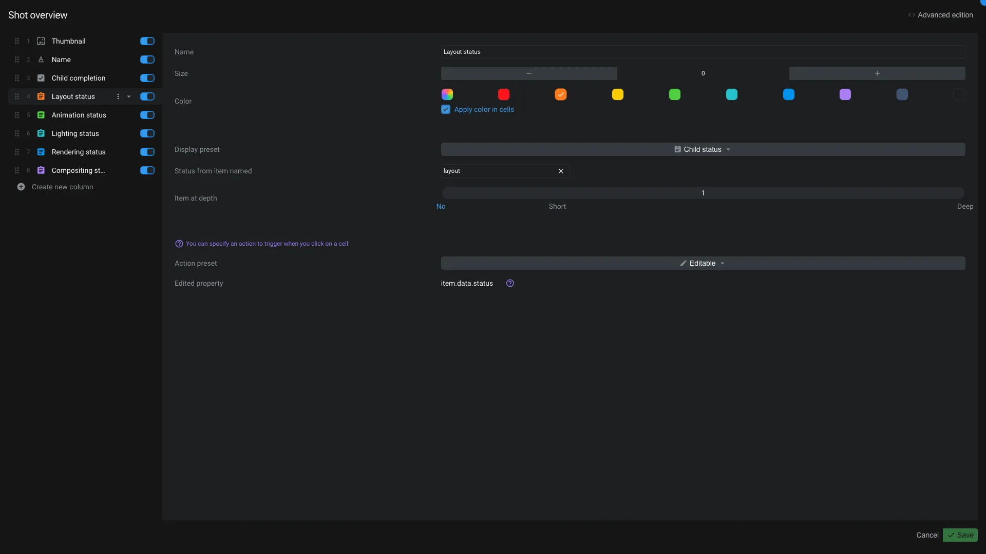
Views
The views application is used to manage view item. A view is used in workspaces to regroup columns together.

On the top of the interface you can change the name of a view.
Edit a column
The left panel displays the list of the columns in the view. You can drag and drop a column to change its position.
At the bottom of that list you have a button to add a new column.
On each column you can hide/unhide it by clicking toggling the switch. In the menu next to the name of the column, you can duplicate or delete it.
Once a column is selected, you can edit its properties on the right panel:
- Name: Name of the column
- Size: Width of the column
- Label color: Color of the column
- Apply label color in cells: Apply the label color in the cells
Under this section, you have dedicated preset and preset's options.
- Preset: Preset configuration for the column. We provide a bunch of presets, based on the data that we handle by default. You can also create your own columns.
On a preset is selected, you can edit its options just under. The options depends on the preset selected.
Feel free to contact us if you think a preset or an option is missing.
Under the preset's options, you can choose the behavior of the click on the column:
- None: Nothing happens when you click on the column
- Editable: Will allow you to edit the content of the column. Like changing the name of the item, changing the status, etc.
- Open current item: Will open the line item in the default application.
- Each application can have parameters passed to it. You can set them in the
App parameterssection. If you want its parameters to be resolved dynamically, you can check theSend app parameters as meshQLcheckbox.
- Each application can have parameters passed to it. You can set them in the
- Browse current item: Will navigate into the line item.
- Open app: Allow you to open the line item or the cell item with a specific application.
- You can also use app parameters and send them as meshQL.
On top of the application, you have a button Advanced edition to see the JSON data of the view.
There is a special preset called advanced. It allows you to edit the column as code, without loosing your changes.
So, if you use the advanced edition button, do not modify the columns that are not using the advanced preset. You will loose your changes.
Advanced edition
You can view and edit column's code. You can use that to create you own columns.
A column is defined by the following properties:
{
  "preset": "childStatus", // Preset id used by the column
  "name": "Layout status", // Name of the column
  "type": "status", // Type of the column
  "model": "item.data.status", // The property where to save the edited value. Used only if the column is editable
  "width": "150px", // Width of the column
  "set": { // SET variable for the column using meshQL.
    "setlayoutstatusu66f17f97": "FIRST(# -($Child,1)> item.data.name == 'layout' VIEW item)"
  },
  "data": { // Data configuration for the column using meshQL
    "itemKeys": "setlayoutstatusu66f17f97._key", // Item _keys of the content of the cell. It's used to know on which entity the model need to be saved.
    "value": "setlayoutstatusu66f17f97.data.status", // The actual value displayed in the cell
    "color": "setlayoutstatusu66f17f97.data.color" // Some columns type can have a color
  },
  "id": "u66f17f97", // Each column need to have a unique id. The id need in the current view. By default Aquarium take care of it by checking if no other columns have the same id.
  "labelColor": "#fd7b1f", // The color of the label
  "applyLabelColorInCells": true // Apply the label color in the cells
}
Feel free to check the code on existing column to have more example on how it works. Some preset have other properties available.
When you create a custom column, you mainly need to provide a type and the data object with a value. If you want the column to be editable, you need to provide a model property.
Columns types
When you create a custom column, you can choose between different types:
| Type | ID | Description |
|---|---|---|
| Text | text |
Used to display one line of text |
| Textarea | textarea |
Allow to display multiple lines of text with markdown |
| Number | number |
Used to display a number |
| Checkbox | checkbox |
Used to display a checkbox |
| Date | date |
Used allow to display a date |
| Duration | duration |
Used to display a duration |
| Timecode | timecode |
Used to display a timecode |
| Image | image |
Used to display an image |
| Tags | chips |
Used to display tags |
| Url | url |
Used to display an url |
| List | list |
Used to display a list |
| Badge | badge |
Used to display a badge |
| Button | button |
Used to display a button |
If you think a type is missing, feel free to contact us.
